Pantone vs RAL: What's the Difference and When to Use Each
Pantone or RAL — which color system should you use? A complete comparison covering use cases, industries, accuracy, and how to find both codes instantly with WhtColor.
Pantone vs RAL: What's the Difference and When to Use Each
An interior architect specifies "RAL 7021 for the feature wall" while a brand designer insists on "Pantone 485 C for the logo." Both are talking about color. Both are referencing industry standards. But these two systems live in entirely different worlds — and confusing them can cost you time, money, and accuracy.
This guide breaks down what Pantone and RAL actually are, where each system belongs, and how to choose the right one for your project.
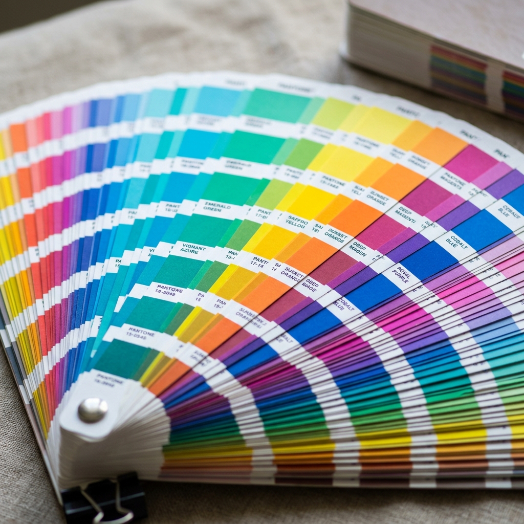
What is the Pantone System?
The Pantone Matching System (PMS) was created in 1963 by Lawrence Herbert in New Jersey. It was built to solve a fundamental problem in the print industry: the same color looked different depending on the printer, the press, and the paper.
Pantone's solution was elegant — instead of mixing four process inks (CMYK) and hoping for the best, Pantone defined colors using pre-mixed, proprietary ink formulas. Each color gets a unique code. Any printer in the world using that code can reproduce the exact same hue.
How Pantone Codes Work
Pantone codes are alphanumeric and indicate both the color and the substrate it will be printed on:
- Pantone 485 C — C = Coated paper (glossy)
- Pantone 485 U — U = Uncoated paper (matte)
- Pantone 485 M — M = Matte finish
The same color on coated paper looks noticeably more vivid than on uncoated paper, so Pantone codes for the substrate. This makes Pantone extremely precise for print reproduction.
What Does Pantone Cover?
Over the decades, Pantone expanded far beyond print:
- Pantone Matching System (PMS): Print, packaging, and graphic design
- Pantone Fashion, Home + Interiors (FHI): Textiles, fabrics, and soft furnishings
- Pantone Plastics: Industrial plastic manufacturing
- Pantone Color of the Year: Annual trend color announcement followed globally
Today, Pantone's full library spans more than 10,000 colors across all its collections. That breadth makes it the universal language of graphic design, fashion, and brand identity.
What is the RAL System?
RAL (short for Reichs-Ausschuss für Lieferbedingungen) was established in Germany in 1927. The first collection had just 40 colors. The current RAL Classic collection contains 213 colors; the RAL Design system extends that to 1,625.
RAL is built for physical surfaces: wall paint, powder coating, aluminum profiles, PVC frames, steel structures, concrete coatings. Rather than defining a color by its ink formula, RAL defines it by a standardized reference sample that paint manufacturers calibrate against.
How RAL Codes Work
RAL Classic uses a four-digit numbering system. The first digit identifies the primary color group:
| First Digit | Color Group | |-------------|-------------| | 1 | Yellows | | 2 | Oranges | | 3 | Reds | | 4 | Violets | | 5 | Blues | | 6 | Greens | | 7 | Greys | | 8 | Browns | | 9 | Whites and Blacks |
RAL 9016 Traffic White, RAL 7016 Anthracite Grey, RAL 3020 Traffic Red — the names often reflect the color's original designated use.
What Does RAL Cover?
RAL dominates the following sectors:
- Architectural and interior wall paints
- Powder coating and industrial coatings
- Aluminum and PVC window and door frames
- Structural steel and metal fabrication
- Traffic signs and safety markings
- Industrial machinery and equipment
The Core Differences Between Pantone and RAL
1. Primary Use Case
| Feature | Pantone | RAL | |---------|---------|-----| | Primary domain | Print, graphic design, fashion | Paint, construction, architecture | | Medium | Paper, fabric, screen | Wall, metal, plastic, concrete | | Typical user | Graphic designer, fashion designer | Architect, interior designer, painter | | Number of colors (main set) | 1,800+ spot colors | 213 Classic colors | | Country of origin | USA | Germany |
2. How Colors Are Defined
Pantone defines color through ink formulas. RAL defines color through reference samples.
In practice: reproducing Pantone 185 C requires the correct proprietary ink ratio. Reproducing RAL 3020 requires a paint brand's calibrated mixing formula aligned to that RAL reference chip.
This distinction matters enormously. A wall paint supplier has no way to "make Pantone 185 C" — their machines are calibrated to RAL. But ask them for RAL 3020, and it comes out in under ten minutes.
3. Geographic Reach
Pantone is the global standard for graphic design and fashion. A design agency in São Paulo and a print house in Tokyo both speak fluent Pantone.
RAL is the dominant standard in Europe — especially Germany, the Netherlands, and surrounding markets — and has been widely adopted across the Middle East, Turkey, and parts of Asia for the construction and paint industries. In North America, paint brands like Sherwin-Williams or Benjamin Moore run their own proprietary color systems rather than RAL.
4. Color Range
Pantone offers far more nuanced options, particularly in the fashion and textile space where subtle differences in tone can make or break a collection. Its breadth is a core advantage for designers working with fine gradations.
RAL Classic's 213 colors may seem limited, but they were deliberately chosen to cover the most essential hues in construction and industrial work. The RAL Design system, with 1,625 colors organized along the CIE Lab color space, is used when more precision is needed in architectural specifications.
5. Cost and Accessibility
Pantone catalog books and licensing costs are higher than RAL references. For architects and contractors who primarily deal with paint, adopting the RAL standard is far more economical — and universally understood by suppliers.
When Should You Use Each System?
Choose Pantone When:
- You're designing a logo or brand identity and need color consistency across different printers worldwide
- You're working in fashion or textiles — specifying thread colors, fabric dyes, or garment prints
- You're designing packaging and need exact color reproduction on press
- You're working on international projects where design files will be printed in multiple countries
Choose RAL When:
- You're specifying a wall paint, exterior facade, or ceiling color
- You're ordering aluminum or PVC window and door frames
- You're commissioning powder coating or industrial finishing
- You're visiting a paint store in Europe or Turkey — their mixing machines are calibrated to RAL
- You're writing a technical specification in an architectural project
Why RAL Is the Better Choice for Interior Design and Paint Projects
When a client shows you a photo from Pinterest and says "I want this exact color on my walls," your job as an interior designer is to translate that inspiration into a RAL code.
Here's why: every major paint brand operating in Europe, Turkey, and most of the Middle East supports RAL. Filli Boya, Marshall, Jotun, DYO, Betek — walk into any of their stores, say "RAL 7021" and the mixing machine will produce it in minutes. Pantone offers no equivalent guarantee in a paint store context. Most paint retailers simply don't stock or calibrate to Pantone.
Beyond availability, RAL is calibrated specifically for physical paint surfaces — mat, satin, gloss. The same RAL code on a matte wall versus a gloss door will look slightly different, but that's a known, manageable variable. Interior designers account for it in their specifications.
RAL also integrates seamlessly into the full material specification chain. When you specify RAL 7016 Anthracite Grey for a window frame, a metal railing, and a section of wall paint, each supplier — the aluminum fabricator, the powder coater, the paint retailer — interprets that code consistently. You can't do that with Pantone across those different material types.
Finding Both Codes with WhtColor
You no longer have to manually hunt through color books to figure out whether an inspiration image maps to Pantone 7690 C or RAL 5008. WhtColor lets you upload any photo and instantly extract the HEX, RGB, RAL, and Pantone codes for any color in the image.
The workflow is straightforward:
- Upload your inspiration image — a photograph, a screenshot, a rendered visualization
- Click on any color in the image
- Get the HEX, RGB, RAL, and Pantone codes instantly
Whether you're presenting a Pantone reference to a print bureau or walking into a paint store with a RAL code, WhtColor gives you the right language for the right context.
Side-by-Side Summary
| | Pantone | RAL | |--|---------|-----| | Founded | 1963 | 1927 | | Origin | USA | Germany | | Color count | 10,000+ | 213 (Classic) | | Primary use | Print, fashion, branding | Paint, industry, architecture | | Paint store support | Very limited | Universal in Europe and Turkey | | Substrate | Paper, fabric | Wall, metal, plastic | | Digital conversion | Yes (HEX/RGB) | Yes (HEX/RGB) | | WhtColor support | Yes | Yes |
Both systems are the right tool in the right context. For print and brand work, Pantone is irreplaceable. For paint specifications, architectural detailing, and any project ending with a brush or spray gun on a physical surface, RAL is your system.
Knowing which to use — and being able to find the code quickly from any inspiration image — is where professionals gain a clear edge.
Find Pantone and RAL Codes from Any Photo
Upload any inspiration image and instantly extract HEX, RGB, RAL, and Pantone codes. Bring the exact code to your print bureau or paint store.
Find RAL Code